Email Countdown Timer Background Options: Complete Guide
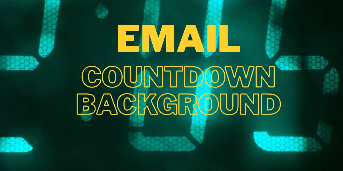
Mastering Backgrounds in Email Countdown Timers
Your countdown timer is ticking — but is it looking its best? The background of your countdown timer is more than decoration. It sets the mood, reinforces your brand, and makes the difference between a timer that blends in and one that compels a click. This guide walks you through every background option available in Countdown Builder and shows you exactly how to use each one.
Why Background Matters in Email Countdowns
Email clients are notoriously restrictive. Yet a well-designed countdown timer background can:
- Match your email template's color scheme seamlessly
- Create visual hierarchy that draws the eye to the ticking clock
- Add depth and polish without heavy file sizes
- Reinforce your brand personality (bold, minimal, festive, urgent)
Let's walk through all the background options available to you.
1. Transparent Background
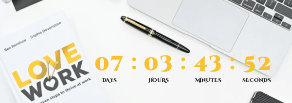
The simplest and most versatile option. With a transparent background, the countdown timer sits directly on top of whatever your email's background color or image is — no white boxes, no clashing colors.
Best for:
- Newsletters with a defined background color or texture
- Situations where you want the timer to feel like a native part of the email layout
- Minimal, clean designs
How to use it: Select Transparent from the Background options. The timer will inherit the visual context of whatever sits behind it in your email template.
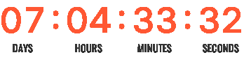
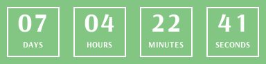
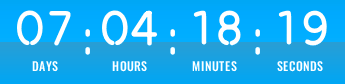
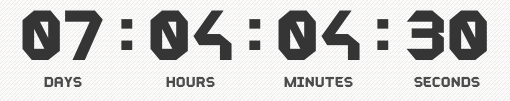
2. Background Color
A flat, solid background color applied directly behind your countdown timer. Clean, distraction-free, and easy to brand-match.
Best for:
- Professional and corporate emails
- When you want a clear visual separation between the timer and the rest of the email
- Quick setup with a polished result
How to use it: Choose Background Color, then use the color picker to select any solid color. Use your brand's primary or accent color for instant consistency.
3. Background Color with Effects
This is where things get exciting. Take your solid background color and layer one of 13 visual effects on top to add depth, dimension, and style — all while keeping the file lightweight.
Available effects:
| Effect | What It Does |
|---|---|
reflective | Adds a subtle mirror-like sheen across the surface |
topToBottom | Gradient fades from a darker top to a lighter bottom |
bottomToTop | Gradient fades from a lighter top to a darker bottom |
centerSplit | Color radiates from the center outward to the edges |
radial | Soft circular glow emanating from the middle |
radialInverse | Dark center fades outward — a spotlight-in-reverse feel |
diagonal | A diagonal gradient sweep across the background |
vignette | Darkened edges focus attention on the center |
glossy | A bright highlight across the upper portion — like polished plastic |
overlayFade | A soft semi-transparent overlay that refines contrast |
dualTone | Two complementary tones blended across the background |
noise | Adds a subtle grainy texture for an organic, editorial feel |
sunburst | Radiating rays burst from the center — perfect for sales and urgency |
How to use it:
- Select Background Color with Effects
- Choose your base color
- Pick an effect from the dropdown
- Preview the result live and adjust the color to suit
Pro tip: sunburst and vignette are particularly effective for flash-sale and limited-time offer emails — they naturally direct attention to the countdown digits.
4. Custom Background Image
For maximum creative control, upload your own background image. This option gives you two distinct display modes: No Repeat and Repeat.
4a. No Repeat
In this mode, your image is placed centered behind the countdown timer.
How cropping works: If your background image is larger than the countdown timer dimensions, the excess will be clipped. Only the central portion of the image will be visible within the timer boundaries.
Fitting a full image behind the timer: If you want your entire background image to be visible — for example, a product photo or a branded banner — you can use the padding controls (left, top, right, bottom) to expand the space around the countdown digits. This effectively places the timer on top of your image rather than clipping it.
You can also adjust the size of the timer itself to match your background image dimensions more precisely.
Best for:
- Product photography as a backdrop
- Custom branded artwork or seasonal imagery
- A specific scene or visual you want the countdown to sit inside
How to use it:
- Enable Use Background Image
- Upload your image
- If your image is larger than the timer, adjust Padding (left, top, right, bottom) to expand the countdown area and reveal more of the image
4b. Repeat (Tiled Image)
In this mode, your background image is tiled — repeated both horizontally and vertically — to fill the entire countdown timer area.
Best for:
- Texture patterns (fabric, paper, noise, geometric shapes)
- Branded repeating patterns or logos
- Subtle background textures that add richness without a single focal point
How to use it:
- Select Background Custom Image → Repeat
- Upload a tileable texture or pattern image
- The image will automatically fill the timer by repeating in all directions
Pro tip: Small, seamless textures work best here. A 100×100px or 200×200px pattern tile gives a clean, professional result.
Choosing the Right Background: A Quick Reference
| Your Goal | Recommended Option |
|---|---|
| Blend into email template | Transparent |
| Clean brand-colored block | Background Color |
| Add depth without images | BG Color + Effect (try vignette or gradient) |
| Maximum urgency/sale feel | BG Color + sunburst effect |
| Product or branded photo | Custom Image → No Repeat (with padding) |
| Rich texture or pattern | Custom Image → Repeat |
Tips for Email-Safe Background Design
- Keep contrast high. Your countdown digits must remain legible against any background. Use dark text on light backgrounds and vice versa.
- Test across email clients. While Countdown Builder generates image-based timers (which render consistently), always preview in your ESP before sending.
- Use padding wisely. Padding isn't just spacing — in No Repeat image mode, it's your primary tool for controlling how much of your background image is visible around the timer.
- Match your email theme. The most effective timers feel like they belong in the email. Pick a background style that complements — not competes with — your template.
Start Building
Head to Countdown Builder and open the Background settings in the timer editor. Experiment with different modes, switch between effects, and preview your timer live before dropping it into your email campaign.
A great background isn't just cosmetic — it's the frame that makes your countdown impossible to ignore.